Bricks and Studs
Preview Live siteA B2B website for a UK company that represents and advises premium toy and collectible brands, with its own brand system and CMS.
- Client
- Bricks and Studs
- Service
- B2B website, brand system and CMS for a UK company
The idea
Bricks and Studs is a UK company working with premium toys, collectible figures and hobby products. It sells on marketplaces, holds its own stock and advises manufacturers who want to grow in the UK and Europe. The founder, Anton, did not want a web shop. He wanted the opposite: a website that presents the company as a serious commercial partner for brands, not as one more Amazon seller.
The brief had a clear test. A first-time visitor has 90 seconds to understand what the company does, which categories it works in and at what level, how representation differs from advisory, to see at least one proof point and to know how to start a conversation. For the look, the client wrote "observatory, not a space theme", and a few days later added that he wanted the atmosphere of the film Dune in his own palette. One rule was not up for discussion: normal scrolling, with no sections that trap the screen and no effects that slow down getting to the information.
How it was built
Brand before the website
I started with the brand system. The client chose between four concepts for the mark and picked a display case on a pedestal, the kind collectible figures are shown in. Along with the mark he got a palette, typography, photography rules and a set of files the team uses every day: Word and PowerPoint templates, a business card and design tokens for the web. Everything on the site comes from the same system, from the menu to the browser icon.
The look: an observatory, not outer space
The background is a dark night with a sparse star field, thin circular lines and the warm light of dunes. There is no planet or rocket anywhere. I kept gold for graphics only, and text is always light or blue, because gold text on a dark background is hard to read.
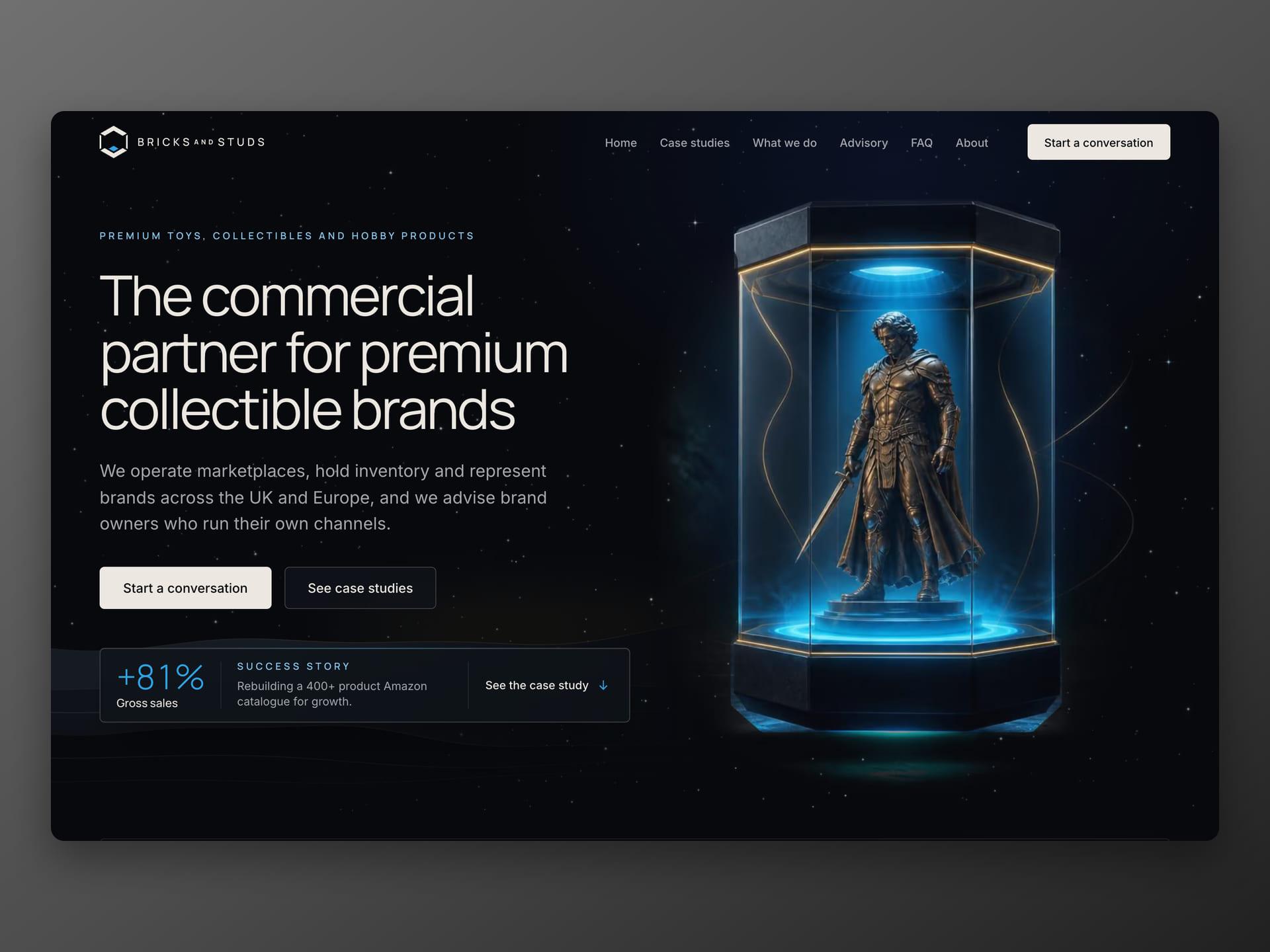
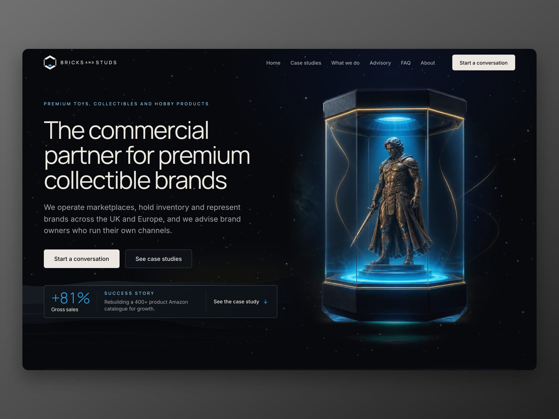
For the first screen I built four versions and put them side by side on a test address, so the client could choose by looking rather than from a description. He chose a display case floating above the floor, with a figure inside.
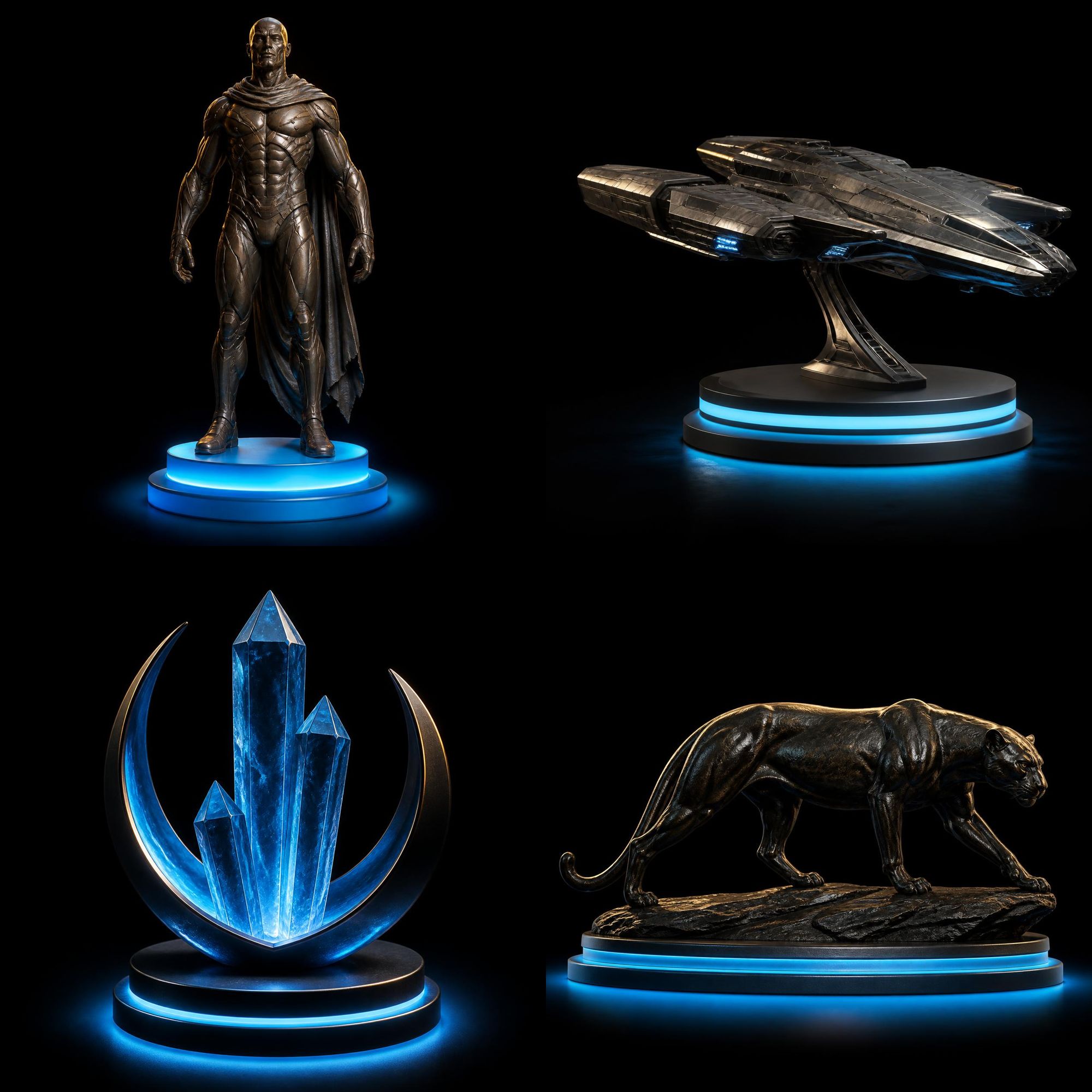
The four product categories have photorealistic 3D illustrations that I made from the client's sketch. They stand on a blue pedestal and tilt slightly towards the cursor. The first versions were drawings, and the client turned them down as not detailed enough. He was right: next to premium figures, a drawing looked cheaper than the product it stood for.
Pages
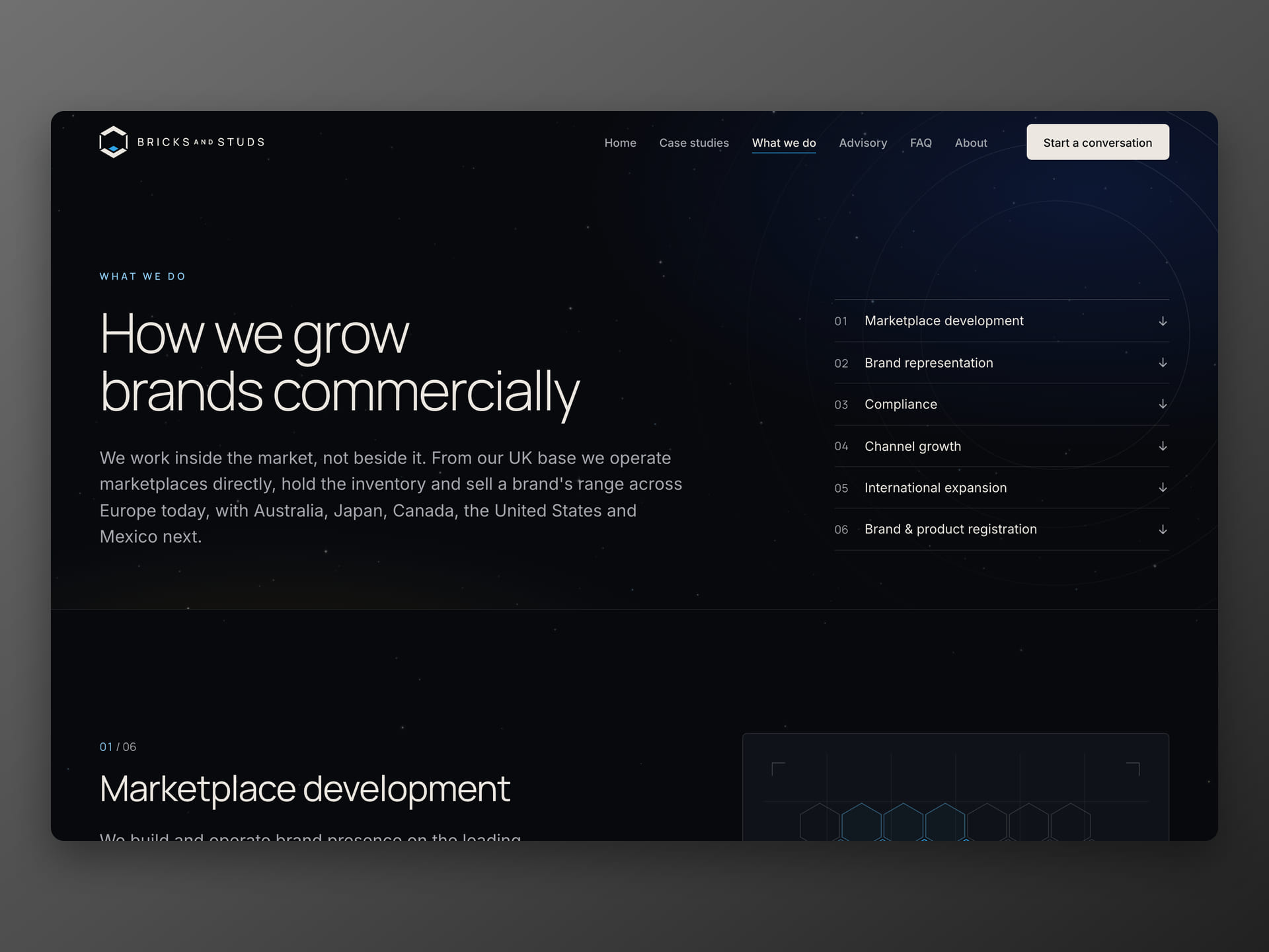
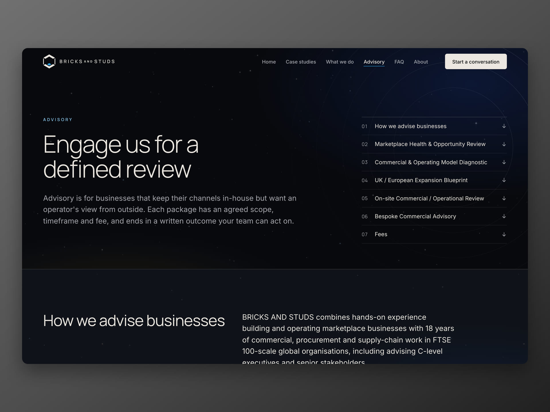
The site has a homepage, case studies built on a repeatable template, a "What we do" page with the markets the company sells in, an advisory page with packages, the founder's story, an FAQ and a contact page. All copy is in British English.
Proof within the first few screens
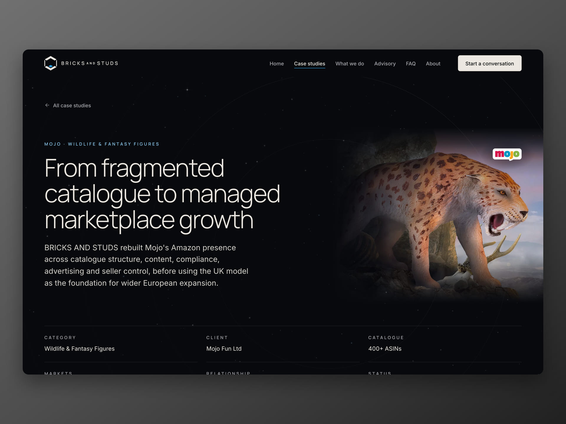
The 90-second test asks for at least one proof point, so the homepage has two right below the hero. The first is a strip of figures: 14 years in collectibles and marketplaces, more than 100,000 items sold in 2026, 13 marketplaces and three warehouses (UK, France, Australia). The second is a success story below the categories. For Mojo Fun, a UK brand of animal figures, Bricks and Studs rebuilt an Amazon catalogue of more than 400 products. Monthly gross sales afterwards were 81% higher than before the rebuild, units sold were up 74%, and Mojo has appointed them its exclusive Amazon partner for the UK and EU from 2027.
These are Bricks and Studs' results for their clients, not results of the website. The website's job is to make sure a visitor sees them before giving up, and the case study's job is to hold up when someone asks "how did you measure that". So next to the figures, the Mojo case study shows how they were measured, the catalogue before and after, and a statement from the client. The second case study follows Cosmic Group and their statue brand Infinite Statue: of about 150 products, roughly a third existed on Amazon, and around a hundred had to be created from scratch.
CMS
The CMS is Payload, built into the same project, as on the website for Lea Gobo. The client edits copy, images, articles, testimonials and advisory package prices himself. He builds a case study from blocks (evidence, before and after, figures, stages, a quote), and a block left empty simply does not show, so a page never has a gap.
Form and privacy
The contact form takes three short steps and has no CAPTCHA. Spam is stopped by a hidden field, a signed, time-limited token and a limit on how often the form can be sent. Google Analytics only starts after consent, and the accept and reject buttons are equally visible, as UK GDPR requires.
Decisions and lessons
A test address from the first week. From the early days the client could open the site and comment on a real page instead of pictures. Decisions about text colour, the hero and menu names were made in short live reviews, not in long email threads.
No scroll effects, even where they would look better. The brief ruled them out, so all motion stays in the background and in the tilt of the illustrations. With reduced motion turned on, the visitor sees a still image.
What went wrong. I built the starry sky three times. The second version looked blurry and stuttered, and every star drifted to the left. The causes were small and technical: the canvas was stretched on high-density screens, stars were scaled down without smoothing, only every other frame was drawn, and all stars shared the same path. The third version draws each star at full sharpness, with its own slow drift and twinkle. The lesson: a background animation needs the same measuring as the rest of the site, not just a good impression on my own screen.
Result
- A B2B website with its own brand system, from the first enquiry on 20 September to the live domain in October 2026.
- The client edits copy, case studies, articles, testimonials and prices himself, without calling me.
- Two case studies with figures (Mojo and Cosmic Group), built from CMS blocks.
- Four 3D category illustrations and a display-case hero, chosen from several versions on the test address.
- Normal scrolling and content available straight away, as the brief asked.
I am not quoting enquiry numbers yet, because there are not enough of them to mean anything.